9,818 search results
(0.082 seconds)
- Hobi by Scholtz Fonts,
$17.00Hobi was influenced by Spaza. In it I tried to highlight the dissonance between the irregular outlines of the characters and the formality suggested by the serifs of the characters. Differences from Spaza are: -- character heights from the baseline; -- the presence of serifs; and -- variations in the character outlines to accomodate the different balance that the characters require in terms of the presence of serifs. Hobi is loose, funky and quite contemporary. The font can be used with great effect in a great variety of applications such as advertisements, flyers, posters, magazine pages and in movie credits. Hobi contains a full character set with all upper and lower case characters, numerals, symbols, accented characters and it has been carefully spaced and kerned. - Rhino by Canada Type,
$24.95This is Canada Type's second Helmut Matheis revival. Rhino is what Matheis did under the name Mobil for the Ludwig & Mayer foundry in 1960. It's an informal text face with some attractive irregularities relating to the traits of handwriting. The influence of the human hand can be clearly seen in letters like the A, J, Q, R, T and pretty much all of the lowercase. Though obviously inspired by and tooled after the human touch, Rhino's functionality extends to even a page or two of text setting. Aside from its functionality, Rhino gives short paragraphs what the classic immersive-reading fonts are not built for: immediate friendliness and natural humility. A few alternates and ligatures are included within the font. - Kattrina Script by Shape Studio,
$10.00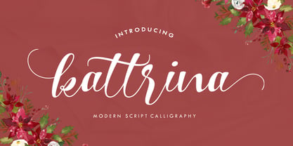 Kattrina is a new modern script calligraphy font with an irregular baseline. Trendy and feminine, Kattrina Script looks lovely on wedding invitations, thank you cards, quotes, greeting cards, logos, business cards and more. Perfect for using in ink or watercolour. Including initial and terminal letters, alternates, ligatures and multiple language support. To enable the OpenType Stylistic alternates, you need a program that supports OpenType features such as Adobe Illustrator CS, Adobe Indesign & CorelDraw X6-X7, Microsoft Word 2010 or later versions. There are additional ways to access alternates/swashes, using Character Map (Windows), Nexus Font (Windows), Font Book (Mac) or a software program such as PopChar (for Windows and Mac). Thank you so much for looking and please let me know if you have any questions.
 - Vintage Reclame by Putracetol,
$32.00 Vintage Reclame is a vintage script font. As the name suggests, this font is inspired by classic billboards/boards. Besides that, I also combine it with a script style and it's a little irregular in its shape / bouncy style. I strengthen the vintage/retro impression with the character ligatures, there are 140 ligatures in this font. But if you want to use this font with a neater impression, you can disable this ligature feature. This font is perfect for projects with vintage/retro and classic themes. But this font is also suitable for logos, branding, greeting cards, invitation cards, advertisements, titles, healines, book titles, stickers, packaging, quotes, posters, t-shirts/apparel, billboards and others. This font is also support multi language.
 - Armalona Script by Shape Studio,
$12.00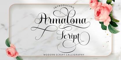 Armalona is a new modern script calligraphy font with an irregular baseline. Trendy and feminine style.Armalona Script looks lovely on wedding invitations, thank you cards, quotes, greeting cards, logos, business cards and more. Perfect for using in ink or watercolour. Including initial and terminal letters, alternates, ligatures and multiple language support.Files included: To enable the OpenType Stylistic alternates, you need a program that supports OpenType features such as Adobe Illustrator CS, Adobe Indesign & CorelDraw X6-X7, Microsoft Word 2010 or later versions. There are additional ways to access alternates/swashes, using Character Map (Windows), Nexus Font (Windows), Font Book (Mac) or a software program such as PopChar (for Windows and Mac).Thanks so much for looking and please let me know if you have any questions
 - Bostero by Din Studio,
$29.00 Bostero- A Grafiti Font Bostero is a graffiti font style that embodies the urban tagging scene. This stylish font features thick, angular letters, and offers uppercase letters only. With its strong outlines and fat strokes, this is the font you need when you want to create that classic bubble graffiti font look. This font can be used for a host of different content needs and projects. Create gorgeous printed quotes, standout packaging, or beautiful t-shirts! You can even use it to create amazing headings, logos, menus, and social media graphics. Our font always includes Multilingual Support to make your branding reach a global audience. Features: Standart Ligatures Stylistic Set Multilingual Support PUA Encoded Numerals and Punctuation Thank you for downloading premium fonts from Din Studio
 - Mido by Design Eva Wilsson,
$30.00 Mido is designed with the aim to recreate all the power of the early 19h century slab serifs, but without their geometric monotony. The ambition was to make a humanist slab serif that would function both in smaller sizes, as headlines, and poster size. Careful attention has been payed to the spaces within and inbetween letters – they show slight irregularities to create dynamic negative spaces, which in turn makes the letters sit solidly together as words and sentences. Mido is suitable for packaging, posters, book covers, identities and headlines, as well as type set in smaller sizes. It comes with both upper- and lower case figures. The typeface Mido is an ongoing design project of which the first font is now released.
 - Hrothberta Script by Shape Studio,
$12.00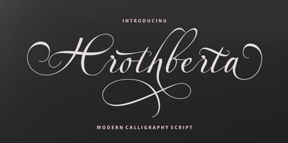 Hrothberta is a new modern script calligraphy font with an irregular baseline. Hrothberta Script looks lovely on wedding invitations, thank you cards, quotes, greeting cards, logos, business cards and more. Perfect for using in ink or watercolour. Including initial and terminal letters, alternates, ligatures and multiple language support. To enable the OpenType Stylistic alternates, you need a program that supports OpenType features such as Adobe Illustrator CS, Adobe Indesign & CorelDraw X6-X7, Microsoft Word 2010 or later versions. There are additional ways to access alternates/swashes, using Character Map (Windows), Nexus Font (Windows), Font Book (Mac) or a software program such as PopChar (for Windows and Mac).Thanks so much for looking and please let me know if you have any questions
 - Blackstore Script by Shape Studio,
$12.00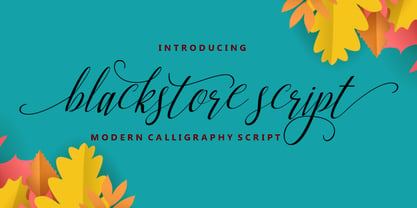 Blackstore Script is a new modern script calligraphy font with an irregular baseline. It looks lovely on wedding invitations, thank you cards, quotes, greeting cards, logos, business cards and more. Perfect for using in ink or watercolour. Including initial and terminal letters, alternates, ligatures and multiple language support. To enable the OpenType Stylistic alternates, you need a program that supports OpenType features such as Adobe Illustrator CS, Adobe Indesign & CorelDraw X6-X7, Microsoft Word 2010 or later versions. There are additional ways to access alternates/swashes, using Character Map (Windows), Nexus Font (Windows), Font Book (Mac) or a software program such as PopChar (for Windows and Mac).Thanks so much for looking and please let me know if you have any questions.
 - Isla by Sudtipos,
$39.00 Eugene Grasset, the popular 19th-century Swiss graphic designer, dabbled in a multitude of disciplines such as ceramics, furniture, tapestry, jewelry and stamp design. Known mostly for his commercial posters and illustrations, he left a legacy of design that still fascinates scholars and professionals alike. One of the rarely mentioned Grasset treasures is the italic he designed in 1898 for use in two of his posters. Grasset's italic has an irregular quality that makes it seem much older than it is. It can be a very meaningful face in many contexts, such as map-related design or historical publications. Isla was digitized by Alfredo Graziani and completed by Alejandro Paul, maintaining the utmost respect for its historical flavor. The typeface includes a wealth of ligatures and alternates.
 - Courageous Script by Shape Studio,
$12.00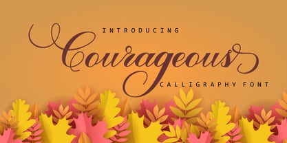 Courageous Script is a new modern, trendy, feminine script calligraphy font with an irregular baseline. Courageous Script looks lovely on wedding invitations, thank you cards, quotes, greeting cards, logos, business cards and more. Perfect for using in ink or watercolour. It includes initial and terminal letters, alternates, ligatures and multiple language support. To enable the OpenType Stylistic alternates, you need a program that supports OpenType features such as Adobe Illustrator CS, Adobe Indesign & CorelDraw X6-X7, Microsoft Word 2010 or later versions. There are additional ways to access alternates/swashes, using Character Map (Windows), Nexus Font (Windows), Font Book (Mac) or a software program such as PopChar (for Windows and Mac).Thanks so much for looking and please let me know if you have any questions
 - Linotte by JCFonts,
$30.00 Linotte is a rounded sans in 7 styles designed by Joël Carrouché. Small irregularities give the typeface a warm and naive look, while the simple geometric construction provides good legibility in long texts and small sizes. Linotte is an ideal choice for food or kids related products, or anything that needs to convey a human and friendly feeling. Originally released in 2014, Linotte was updated in 2021 with Greek and Cyrillic support, two new styles, and other small additions. Linotte Semibold is 100% free for personal and commercial use. The fonts, provided in OpenType format, include diacritics for most European languages, a set of arrows & icons, and a variety of advanced features like stylistic alternates, case-sensitive forms, sub and superscript, automatic fractions, etc.
 - Sunny by Zaki Creative,
$12.00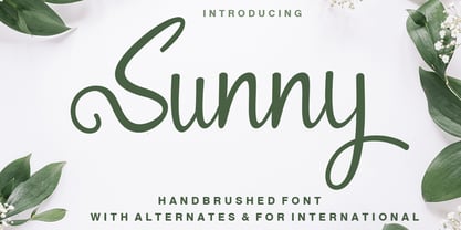 Sunny brush is a new modern script brush font with an irregular baseline. Trendy and feminine style. Sunny looks lovely on wedding invitations, thank you cards, quotes, greeting cards, logos, business cards and more. Perfect for using in ink or watercolour. Including initial and terminal letters, alternates and multiple language support. To enable the OpenType Stylistic alternates, you need a program that supports OpenType features such as Adobe Illustrator CS, Adobe Indesign & CorelDraw X6-X7, Microsoft Word 2010 or later versions. There are additional ways to access alternates/swashes, using Character Map (Windows), Nexus Font (Windows), Font Book (Mac) or a software program such as PopChar (for Windows and Mac). Thanks so much for looking and please let me know if you have any questions.
 - Wooden Bridge by Putracetol,
$22.00 Wooden Bridge - Vintage Display Font. The line of Wooden Bridge is also very unique, so it makes seem irregular, What makes Wooden Bridges unique is vintage touch in the character. Wooden Bridge is inspired by display of the 1970s posters but made flexible enough for everyday use. Wooden Bridge best uses for title, invitation, heading, cover, poster, logos, quotes, product packaging, merchandise, social media & greeting cards and many more The alternative characters were divided into several Open Type features such as Swash, Stylistic Sets, Stylistic Alternates, Contextual Alternates, and Ligature. The Open Type features can be accessed by using Open Type savvy programs such as Adobe Illustrator, Adobe InDesign, Adobe Photoshop Corel Draw X version, And Microsoft Word. Wooden Bridge is also support multi language.
 - Naive by S&C Type,
$8.00 Naïve is a serif handwritten font designed by Fanny Coulez and Julien Saurin in Paris. Our goal was to draw a font with finely irregular lines that give a human and whimsical feeling. The three weights of this subtle Parisian hand-drawn font can be enhanced with two alternates fancy glyphs for each letter, the “Fantaisies”, to improve your designs and bring a more poetic and unusual feeling. We hope you will enjoy our work :) You could follow us on our Instagram: instagram.com/sc.type Merci beaucoup! Note: This font is part of our Naïve superfamily that contains lot of variations: Line, Inline, Serif, Sans Serif, and a special Art Deco one. Just click on our foundry name to see them all!
 - Bainbrydge Script by Shape Studio,
$12.00 Bainbrydge Script is a new and modern font with an irregular baseline. Bainbrydge Script looks lovely on wedding invitations, thank you cards, quotes, greeting cards, logos, business cards and more. It's perfect for using in ink or watercolour. It includes initial and terminal letters, alternates, ligatures and multiple language support. To enable the OpenType Stylistic alternates, you need a program that supports OpenType features such as Adobe Illustrator CS, Adobe Indesign & CorelDraw X6-X7, Microsoft Word 2010 or later versions. There are additional ways to access alternates/swashes, using Character Map (Windows), Nexus Font (Windows), Font Book (Mac) or a software program such as PopChar (for Windows and Mac).Thanks so much for looking and please let me know if you have any questions.
 - Yumo by Thinkdust,
$10.00 Yumo is a new, textured remix of the original 2010 Yume typeface, and has plenty to offer of its own. Angular and blocky, this typeface creates impactful text with a hint of playfulness, expanded upon by its rough finish. There are no extraneous edges to this font because most of them have been subsumed into the characters themselves, so any sharpness it may have from the squared corners is removed by the lack of thin strokes or serifs. Perfect for headlines and large text that wants to stand out, Yumo’s big, bold text will help your message make an impact. Playing with colours on the textured surface only helps to strengthen this effect, so that Yumo will blow people away, whatever you want to say.
 - Thasyalina Script by Shape Studio,
$10.00 Thasyalina is a new modern script calligraphy font with an irregular baseline. Trendy and feminine style. Thasyalina Script looks lovely on wedding invitations, thank you cards, quotes, greeting cards, logos, business cards and more. Perfect for using in ink or watercolour. Including initial and terminal letters, alternates, ligatures and multiple language support.Files included: To enable the OpenType Stylistic alternates, you need a program that supports OpenType features such as Adobe Illustrator CS, Adobe Indesign & CorelDraw X6-X7, Microsoft Word 2010 or later versions. There are additional ways to access alternates/swashes, using Character Map (Windows), Nexus Font (Windows), Font Book (Mac) or a software program such as PopChar (for Windows and Mac).Thanks so much for looking and please let me know if you have any questions
 - Rumble King by Putracetol,
$20.00 Rumble King is a vintage script font. As the name suggests, Rumble King is inspired by classic poster or vintage magazine. Besides that, I also combine it with a script style and it’s a little irregular in its shape style. I strengthen the vintage/retro impression with the character ligatures, there are 140 ligatures in Rumble King. But if you want to use Rumble King Font with a neater impression, you can disable this ligature feature. Rumble King is perfect for projects with vintage/retro and classic themes. But Rumble King is also suitable for logos, branding, greeting cards, invitation cards, advertisements, titles, healines, book titles, stickers, packaging, quotes, posters, t-shirts/apparel, billboards and others. Rumble King is also support multi language.
 - Basco Std by Typofonderie,
$59.00 A mix of Renaissance & tropical atmosphere Basco is an exploration of the Renaissance style, a period in which letterforms were informed primarily by hand writing. It is clearly a contemporary interpretation of calligraphic shapes forms. The serifs are subtly asymmetrical. Slightly curved arches on the n, m and u are noticeable, creating an interesting tension in the text. Bruno Mello’s distinctive style is most obvious in his mastery of super fluid curves. It is a result of his extensive exploration of calligraphic forms, their tensions and dynamics, mixing angularities with curves. The roman weights include alternate swashes, as well as initial and terminal glyphs. The italics, based on chancellery script, feature simple stroke endings, most visible on the s and c. ➼ Basco minisite
 - ITC Coconino by ITC,
$29.99ITC Coconino is the work of Serbian designer Slobodan Miladinov. His original inspiration for this monostroked typeface was the idea of translating certain auditory impressions into type, in this case, the surprising and confusing music of the Serbian hip hop musician Voodoo Popeye." Miladinov is an art director in Belgrade and created Coconino using a "freemouse" technique with Adobe Illustrator and sees his work as "computer calligraphy which allows for a specific directness and immediacy in notation." The strokes of this font are simple and abrupt with a studied irregularity. The forms can look either cheerful and lighthearted or chaotic and subtly disturbing. Coconino was named for the home of hte Krazy KAt comics and even includes a few additional characters from the strip." - Shell Mera by Putracetol,
$24.00 Shell Mera is a slab serif inspired by 1970s cowboy and sheriff posters but made flexible enough for everyday use. What makes this font unique is the difference in the height of each character. The baseline is also not the same, so it makes this font seem irregular Shell Mera best uses for title, invitation, heading, cover, poster, logos, quotes, product packaging, merchandise, social media & greeting cards and many more The alternative characters were divided into several Open Type features such as Swash, Stylistic Sets, Stylistic Alternates, Contextual Alternates, and Ligature. The Open Type features can be accessed by using Open Type savvy programs such as Adobe Illustrator, Adobe InDesign, Adobe Photoshop Corel Draw X version, And Microsoft Word. This font is also support multi language.
 - Bahagia Script by Shape Studio,
$10.00 Bahagia is a new modern script calligraphy font with an irregular baseline. Trendy and feminine style.Bahagia Script looks lovely on wedding invitations, thank you cards, quotes, greeting cards, logos, business cards and more. Perfect for using in ink or watercolour. Including initial and terminal letters, alternates, ligatures and multiple language support. To enable the OpenType Stylistic alternates, you need a program that supports OpenType features such as Adobe Illustrator CS, Adobe Indesign & CorelDraw X6-X7, Microsoft Word 2010 or later versions. There are additional ways to access alternates/swashes, using Character Map (Windows), Nexus Font (Windows), Font Book (Mac) or a software program such as PopChar (for Windows and Mac).Thanks so much for looking and please let me know if you have any questions
 - Ellington MT by Monotype,
$29.99 Ellington was designed by jazz lover, Michael Harvey for Monotype in 1990, and named after the great band leader, Duke Ellington. From experience gained carving letters in stone and drawing them for book jacket designs, Michael Harvey has created a condensed typeface combining the clear-cut sparkle of a modern face with some of the lively features of the broad-edged pen. Ellington has a fresh elegance that is particularly effective in display, while its compressed forms will prove economical in text settings. The Ellington font family has narrow characters with strong vertical strokes and angular calligraphic traits. Ellington is a lively face and an appropriate font choice for advertising and book work. Ellington has a sans serif companion family, Strayhorn.
 - Counter Attack by Ronny Studio,
$19.00 Counter Attack Font is a typeface that emphasizes a more informal and expressive style. It is often used in designs that require a sense of spontaneity or creativity, such as logos, posters or album covers. Freestyle fonts may feature irregular, hand-drawn letters, often with excessive embellishments or decorative elements. This font is designed to convey a sense of energy and movement, and can be used to evoke a certain mood or tone in a design. There are many freestyle font styles available, ranging from more readable and structured designs to more abstract and experimental ones. Features : - All Caps - numbers and punctuation - Alternate & Ligature - Swash Ornament - multilingual - PUA encoded Please contact us if you have any questions. Enjoy Crafting and thanks for supporting us! :) Thank you
 - 1913 Typewriter by GLC,
$38.00 This font was patterned after a few characters on a genuine old 1913 small portable typewriter. It looks like those early typescripts, rough, irregular and eroded, suggestive of mythical famous authors, such as Hemingway, as well as “serie noire” movies or anonymous state employee working in a gloomy Kafkaesque office. It is a complete alphabetic full font. It can be used as web-site titles, poster design, or book editing. It may be preferable, if possible, when printing, to choose a pale color a little rather than condensed - dark grey instead of heavy black, for example - to give the best appearance and to benefit from the full details. The old typewriter character size is 11 to 12 points, but this font easily supports enlargement.
 - Bechamel Roman by Andinistas,
$39.00 BECHAMEL ROMAN was born interpreting unicase letterings of the movie "Willy Wonka and the chocolate factory". Later these ideas matured with flexible tip nib and paper mixing their naive proportions with some classic ingredients of Baskerville, Bodoni, Didot, Round Hand Script, Graffiti and labels found in Venezuela and Colombia. BECHAMEL ROMAN designed to be combined with Bechamel. BECHAMEL Script, Vein, Words & Ornaments were hand drawn to design words and phrases in logos, packaging, posters, envelopes and greeting cards. BECHAMEL ROMAN 1,2,3 & 4 is an experimental font family designed by #carlosfabiancg. It includes an irregular look to communicate craftsmanship. Its multiple upper cases with condensed width and naive lines are notable for their expressive drawing with a high amount of contrast between thick and thin strokes.
 - Space 101 by Azure Studio,
$11.00 Introducing the first typeface by Azure studio, Space 101! Space 101 is a handcrafted chalkboard reminiscent typeface with irregular slender lines and a quirky personality. This typeface is perfect to add character and charm to bodies of text and heading where the slight imperfections tie your whole design together. The inspiration for Space 101 was found in an old signwriting book. The character shapes were updated and improved while still retaining the same charm. The typeface gave me interstellar space travel vibes reminiscent of early books based around space travel, which is why I decided to call it Space 101. I hope you enjoy this typeface and if you have any questions or comments get in touch. I'd love to hear from you. fonts@azurestudio.co.nz
 - Analogia by George Tulloch,
$21.00 Analogia is a digital interpretation of types used in the mid-18th century in books printed at Leuven by Martin van Overbeke. It is intended primarily for use in running text. The roman is businesslike, yet with a distinct personality; it has a generous x-height and is slightly condensed, though without appearing cramped. It is complemented by a more lively italic, which retains some irregularities in the angle of slant that are characteristic of the original. Analogia provides wide support for west, central, and east European languages that use the roman alphabet. Among its OpenType features are ligatures, small caps, several sets of numerals, contextual alternates, intelligent implementation of long ‘s’, and fractions. For more detail, please see the pdf available in the Gallery.
 - Mateo Unique by IbraCreative,
$14.37 Mateo is an extraordinary and unique handwritten typeface that stands out with its captivating originality. With letters that seem like hand-drawn works of art, each character in Mateo carries a distinct personality, exuding a sense of authenticity and creativity. The charmingly irregular lines and artistic flourishes lend this typeface an artistic and handcrafted feel, making it a perfect choice for projects that require a touch of individuality and unconventional style. Mateo’s versatility is showcased in its ability to seamlessly adapt to diverse design contexts, whether used for eye-catching logos, expressive quotes, or artistic illustrations. With its one-of-a-kind appearance, Mateo transcends traditional typefaces, inviting viewers to explore the world of handwritten artistry in every stroke and curve
 - Capital Love by Harald Geisler,
$68.34 Capital Love just contains capital letters decorated with hearts. By pressing a lowercase button a alternative to the uppercase letter will appear. All shapes are drawn individually and do not oblige a geometrical system. The lighthearted vivid ductus remind me of a quality that can be found in the dynamics of Keith Haring drawings. Capital Love is a part of the Light Hearted Font Collection that is inspired by a recording of Jean Baudrillard with the title, "Die Macht der Verführung" (The Power of Seduction) from 2006. Further inspiration came from the article, "The shape of the heart: I'm all yours". The heart represents sacred and secular love: a bloodless sacrifice. by British writer Louisa Young printed in EYE magazine (#43) London, 2002.
 - Macahe by Rômulo Gobira,
$10.00 Macahe is a modern slab serif with dynamic and irregular shapes. It comes with 7 weights, 3 widths and matching (true) italics. The typeface was inspired and name after the city I was born (Macaé-RJ, Brazil), turning the mixture between nature/beach life and the chaotic urban growth into typography. The options (weight, width and true italics) make the font useful both for web and print in multiple occasions; think websites, posters, logos, signage, packaging and etc. Macahe covers multiple languages, including a wide range of Latin and some Cyrillic languages. It also includes a full range of numerals (included old style figures, numerators, denominators), small caps, standard & discretionary ligatures and stylistic alternates. Those features and variations make Macahe a useful tool for any graphic designer.
 - Sweet Lady by Black Studio,
$15.00 Sweet Lady Script is a new modern script font with an irregular baseline. Feminine style and style. Sweet Lady Script looks beautiful in wedding invitations, thank you cards, quotes, greeting cards, logos, business cards and many more. Perfect for use in ink or watercolor. Includes start and end letters, alternatives and support for many languages. To activate the OpenType Stylistic alternative, you need a program that supports OpenType features such as Adobe Illustrator CS, Adobe Indesign & CorelDraw X6-X7, Microsoft Word 2010 or a later version. There is an additional way to access alternatives / swashes, using the Character Map (Windows), Nexus Fonts (Windows), Font Books (Mac) or a software program such as PopChar (for Windows and Mac). How to access all alternate characters: Thank you for purchasing!
 - Glowing Midnight by Nathatype,
$29.00 Looking for a font that will make your branding stand out? Do you sometimes have an appetite for a bit more wholesome typography? Looking for a fabulous, stylish, and adventure font? We've got what you want. Glowing Midnight-A Script Font Glowing Midnight is a unique script font with retro touch. This font features thick and angular letters that easy on the eyes and nice to look while it’s also easy to read. Glowing Midnight becomes more special with extruding version option. Well suited to titles, poster designs, branding, logos, and many more. Our font always includes Multilingual Support to make your branding reach a global audience. Features: Ligatures Stylistic Set Swashes PUA Encoded Numerals and Punctuation Thank you for downloading premium fonts from Natha Studio
 - Alisya Script by Shape Studio,
$16.00 Alisya is a new modern script calligraphy font with an irregular baseline. Alisya looks lovely on wedding invitations, thank you cards, quotes, greeting cards, logos, business cards and more. Perfect for using in ink or watercolour. Including initial and terminal letters, alternates, ligatures and multiple language support. To enable the OpenType Stylistic alternates, you need a program that supports OpenType features such as Adobe Illustrator CS, Adobe Indesign & CorelDraw X6-X7, Microsoft Word 2010 or later versions. There are additional ways to access alternates/swashes, using Character Map (Windows), Nexus Font (Windows), Font Book (Mac) or a software program such as PopChar (for Windows and Mac).Thanks so much for looking and please let me know if you have any questions
 - Amabile by REN FONT,
$25.00 Hello. Welcome to the Foundry "REN FONT"! I am a Japanese font artist, and this is my first challenge at a full-fledged Latin fonts. The typeface name is “Amabile (Adorable, прекрасный, Αρκετά/Αξιολάτρευτο)”. It means “lovely” in music terms. The design feature reflects the feature of Japanese typeface “Waon”, as the depending latin characters of which this typeface is designed. “Amabile” briefly expresses the basic concept of Waon, to “Express a music with typeface”. The non-Japanese characters in the Japanese font are basically composed with Latin, Cyrillic, and Greek. In addition to these 3 types of characters, “Amabile” have the capability of 87 languages by extending character types so called “W1G”, which consists of Latin supplements, Cyrillic supplements, Greek supplements, Latin extensions. We no longer offer free Regular weights for OpenType. こんにちは。ファウンドリー "REN FONT" へようこそ! 私は日本人のフォント作家ですが、初めて本格的な欧文フォントに挑戦しました。 この書体の名前は「Amabile(アマービレ)」。音楽用語で「愛らしく」という意味があります。 「和音」の従属欧文として制作された性格上、当然ながら「和音」の特長を反映したデザインになっています。 「和音」の基本コンセプトである「文字で音楽を表現する」を、最も端的に文字通り「表現」しているのがこの「Amabile」です。 ほとんどの和文書体の従属欧文は Latin, Cyrillic, Greek の3種類が基本です。「Amabile」はこの3種類に Latin 補助、Cyrillic 補助、Greek 補助、Latin 拡張などを加えた、いわゆるW1Gの規格にプラスアルファし、87か国言語を表現できる多言語フォントに生まれ変わりました。 グリフ形状は、比較的自由にデザイン表現が可能な Latin 以外は「Amabile」の特徴を残しつつ、ネイティブの形状を壊さない、ぎりぎりの選択を施してあります。 OpenType の Regular ウェイトの無料提供は終了しました。
 - Copihue by Letritas,
$30.00 Copihue is the newest font from the foundry of Juan Pablo De Gregorio. A Sans-Serif with some humanist hints, it displays simple and subtle yet sober, vivid strokes. This font’s personality unfolds itself as long as we are reading it. The aim of Copihue is neither to be as neutral as a grotesque font nor to become as predictable as a fully geometric typeface can be. This typography wants to appeal to the likes of designers who prefer all-rounder fonts, the ones who fit well in most layouts. With this purpose in mind, Juan Pablo studied elements of different typefaces and styles to cast them into Copihue, which boasts a personality that makes it a great fit for different compositions and designs. Copihue has a slanted version with "real italics". These italics are slightly more condensed than the regular version, in order to give it a different text texture. The typeface has 9 weights, ranging from “hair” to “black”, and two versions: "regular" and "italic". Its 18 files contain 749 characters with ligatures, alternates, small caps, oldstyle and tabular numbers, fractions, and case sensitive figures. It supports 219 Latin-based languages, spanning through 212 different countries. Copihue supports this languages: Abenaki, Afaan Oromo, Afar, Afrikaans, Albanian, Alsatian, Amis, Anuta, Aragonese, Aranese, Aromanian, Arrernte, Arvanitic (Latin), Asturian, Atayal, Aymara, Bashkir (Latin), Basque, Bemba, Bikol, Bislama, Bosnian, Breton, Cape Verdean Creole, Catalan, Cebuano, Chamorro, Chavacano, Chichewa, Chickasaw, Cimbrian, Cofán, Corsican Creek,Crimean Tatar (Latin),Croatian, Czech, Dawan, Delaware, Dholuo, Drehu, Dutch, English, Estonian, Faroese, Fijian Filipino, Finnish, Folkspraak, French, Frisian, Friulian, Gagauz (Latin), Galician, Ganda, Genoese, German, Gikuyu, Gooniyandi, Greenlandic (Kalaallisut)Guadeloupean, Creole, Gwich’in, Haitian, Creole, Hän, Hawaiian, Hiligaynon, Hopi, Hotc?k (Latin), Hungarian, Icelandic, Ido, IgboI, locano, Indonesian, Interglossa, Interlingua, Irish, Istro-Romanian, Italian, Jamaican, Javanese (Latin), Jèrriais, Kala Lagaw Ya, Kapampangan (Latin), Kaqchikel, Karakalpak (Latin), Karelian (Latin), Kashubian, Kikongo, Kinyarwanda, Kiribati, Kirundi, Klingon, Ladin, Latin, Latino sine Flexione, Latvian, Lithuanian, Lojban, Lombard, Low Saxon, Luxembourgish, Maasai, Makhuwa, Malay, Maltese, Manx, M?ori, Marquesan, Megleno-Romanian, Meriam Mir, Mirandese, Mohawk, Moldovan, Montagnais, Montenegrin, Murrinh-Patha, Nagamese Creole, Ndebele, Neapolitan, Ngiyambaa, Niuean, Noongar, Norwegian, Novial, Occidental, Occitan, Old Icelandic, Old Norse, Oshiwambo, Ossetian (Latin), Palauan, Papiamento, Piedmontese, Polish, Portuguese, Potawatomi, Q’eqchi’, Quechua, Rarotongan, Romanian, Romansh, Rotokas, Sami (Inari Sami), Sami (Lule Sami), Sami (Northern Sami), Sami (Southern Sami), Samoan, Sango, Saramaccan, Sardinian, Scottish Gaelic, Serbian (Latin), Seri, Seychellois Creole, Shawnee, Shona, Sicilian, Silesian, Slovak, Slovenian, Slovio (Latin), Somali, Sorbian (Lower Sorbian), Sorbian (Upper Sorbian), Sotho (Northern), Sotho (Southern), Spanish, Sranan, Sundanese (Latin), Swahili, Swazi, Swedish, Tagalog, Tahitian, Tetum, Tok Pisin, Tokelauan, Tongan, Tshiluba, Tsonga, Tswana, Tumbuka, Turkish, Turkmen (Latin), Tuvaluan, Tzotzil, Uzbek (Latin), Venetian, Vepsian, Volapük, Võro, Wallisian, Walloon, Waray-Waray, Warlpiri, Wayuu, Welsh, Wik-Mungkan, Wiradjuri, Wolof, Xavante, Xhosa, Yapese, Yindjibarndi, Zapotec, Zulu, Zuni.
 - Preissig Antikva Pro by Storm Type Foundry,
$39.00 This vintage, iconic typeface of original Czech letter-founding has been faithfully revised, extended and newly rendered in 2012. The majority of Vojtěch Preissig’s type faces have been, from their very creation, subject to controversial evaluations which might perhaps fill more pages than have been set in these type faces so far. The considerable technological backwardness of Czech typography between the world wars intensified the author’s creative effort even more. He had been devoting thought to his Antikva type face from 1912 onwards and dozens of hardly perceptible nuances of the same design have been preserved in his drawings. It was his only book type face, but it shows no signs of any hard struggle in creating it. Its extraordinary vividness and elegance are really surprising. It may be still indebted to the forms of Art Nouveau, which was withering away at that time, but its proportions, colour and expression inspire other Czech type designers. Preissig’s Antikva, Menhart’s Figural (and also Růžička’s Fairfield) and Týfa’s Antikva represent a clear line of development, very far away from the soft aesthetics of Tusar, Dyrynk or Brunner. The co-author of the modification for computer composition is Otakar Karlas. Without his experience the work would remain only a shadow of Preissig’s design. Our aim was to produce a large family of type faces for the setting of both books and jobbing works. The digital transcription of Preissig’s Antikva came into existence from summer till winter 1998. The direct model for this type face is the most successful, two-cicero (24 pt.) design dating from 1925. The designs of other sizes (12 pt., 14 pt., 16 pt. and then 36 pt. and 49 pt.) lack vividness and are the source of the widespread mistaken belief that Preissig’s Antikva consists of straight lines. That is, unfortunately, how even Muzika and Menhart describe it. Neither is it a Cubist type face as many of the semi-educated think today. Special attention had to be paid to italics. It is apparent that their design is not as perfect as that of Preissig’s Antikva. In contradistinction to the original we have deleted almost all lower serifs in the lower-case letters, enlarged the angle of inclination and completely redesigned the letters a, e, g, s, k, x, ... All crotches have been lightened by marked incisions. In other words, none of the italic letters corresponds to Preissig’s model. The signs which were missing have been supplemented with regard to the overall character of the alphabet. Preissig did not deal with bold designs, but the crystal-clear logic of his “chopping-off” of the round strokes enabled us to complete the type face family without any greater doubts. An excessively fragile type face, however, cannot be used for setting in smaller sizes; that is why we have prepared a separate family of text designs which has shortened ascenders, normal accents, slightly thickened strokes, and is, in general, optically more quiet and robust. We recommend it for sizes under 12 points. By contrast, the elegance of the basic design will be appreciated most in the sizes used for headlines and posters. Preissig’s Antikva is suitable not only for art books and festive prints, but also for poetry and shorter texts.
 - PS Fournier Std by Typofonderie,
$59.00 Style and elegance in 14 styles PS Fournier, created by Stéphane Elbaz, is designed in tribute to Pierre Simon Fournier. Fournier was the prolific Parisian type designer whose work is best known for its iconic representation of French transitional style. PS Fournier elegantly represents the transition to the modern era of typography. Featuring three optical sizes, PS Fournier is designed to perform in any context. The Pierre Simon Fournier heritage Pierre Simon Fournier (1712—1768) was a leading innovative type designer of the mid-18th century. Early in his career, the young Pierre Simon developed a strong aesthetic that he cultivated throughout his life. His art is representative of the pre-revolutionary “Age of Enlightenment” (Siècle des Lumières). Precursor of the Modern style, Fournier’s body of work deeply influenced his times, and created the fertile ground from which the Didot family and Giambattista Bodoni developed their own styles. During the historical period of the 18th century, Fournier exemplified the intellectual pursuits of the times with his own research on type, documenting in detail the typefounding process. He also offered a unique vision: he is the first to clearly comprehend the concept of “type family,” sorting a set of similarly styled alphabets by sizes, width, and by x-heights. In addition, Fournier is one of the earliest advocates of the point system to organize the practice of typography, the point system that contemporary typographers continue to use to this day. The refined and discreet elegance of PS Fournier With a close look at the family, one finds you’ll find that the difference between the optical sizes (Petit, standard and Grand) is more than a contrast variation between the thin and the thick; the eye can also denote a palette of distinct tones: More streamlined and robust in the smaller sizes (Petit), more refined and detailed in the larger sizes (Grand). The PS Fournier standard family is designed to adapt to any situation with its intermediate optical size, from body copy to headlines. With a bit of tracking, PS Fournier Petit will make the smallest captions perfectly readable. However, Petit family is not limited to body and captions — its “slabby robustness” will make a relevant headline choice as well. PS Fournier Grand presents a higher contrast adapted to large text sizes, displays or banners. Its refined elegance makes it a perfect choice for Design, Fashion or Luxury publications. As a “modern” type PS Fournier Grand features a larger x-height than the preexistent old style typefaces such as Garamond or Jenson. These proportions provide any basic text set in PS Fournier Grand a strong typographic texture. As a result, the PS Fournier global family is a versatile alternative to the Modern typefaces commonly used in the publishing industry. The optical sizes, the large range of weights, and the design variations make this family adaptable to captions, paragraphs, and pages, as well as to large texts and displays. A leading-edge typography in the 18th century In the spirit of modernity, Pierre Simon Fournier did not find any use for the conventional swashes still produced by peers such as Caslon or Baskerville. Nevertheless the French designer created many inventive elements to decorate the page and set delightful variations in the text itself. To this regard PS Fournier includes a large set of glyphs variations, ligatures and more than one hundred glyphs for borders, rules and ornaments or — as called in French — “vignettes.” PS Fournier: A tribute to the French modern typography era by Stéphane Elbaz
 - The Deutschlander II font is a display sans-serif typeface with a distinct vintage or retro aesthetic, specifically evoking the feel of post-war European news headlines ...